Visual Case Studies - Enhanced Design Impact
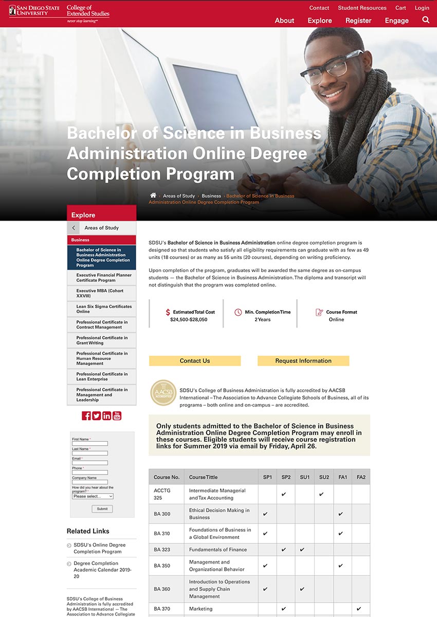
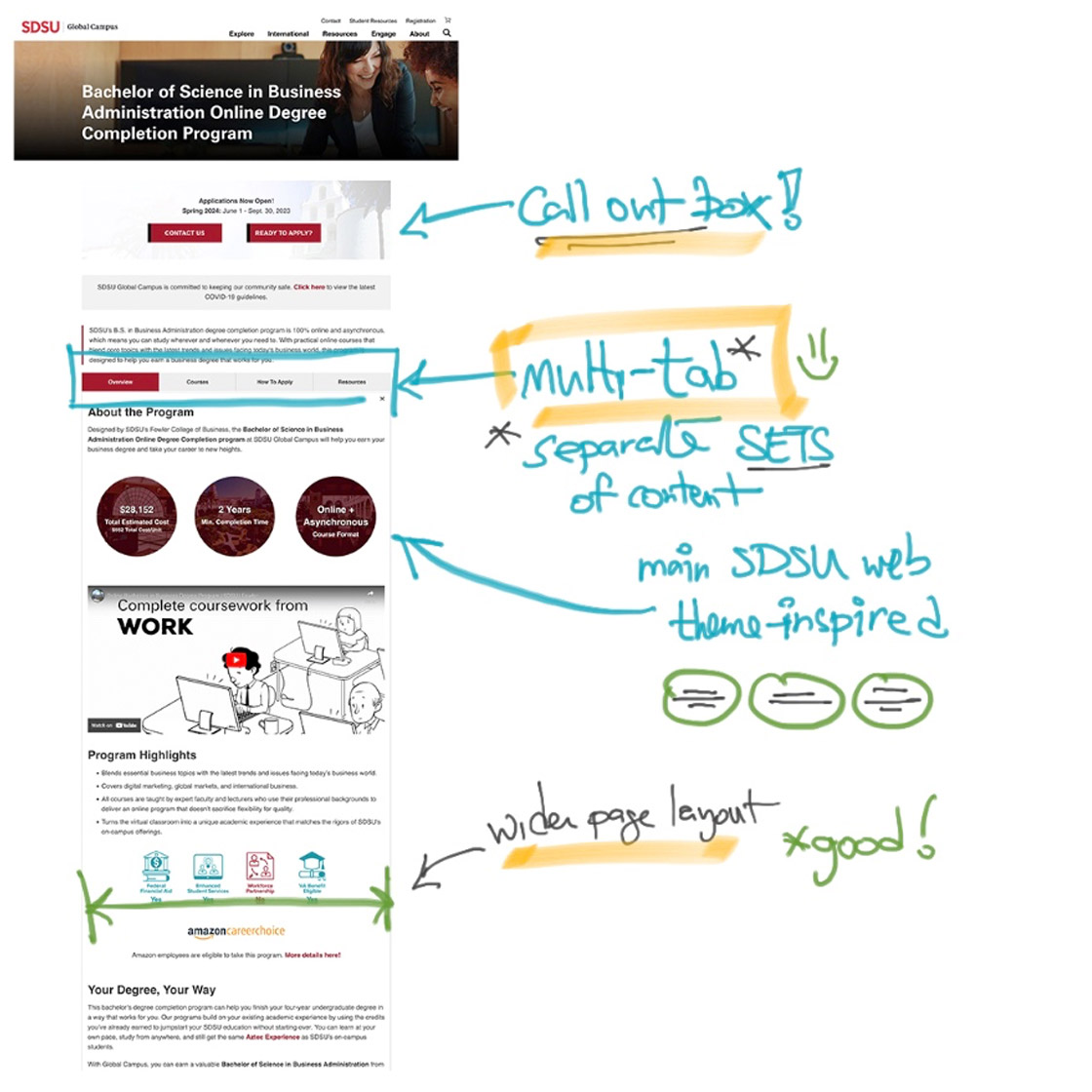
During the rebranding initiative, we received feedback that the original program pages were loaded with "walls of content" where students experienced endless scrolling. On mobile, the lead gen in the sidebar form showed difficult to get to.
- Reconcile the walls of content
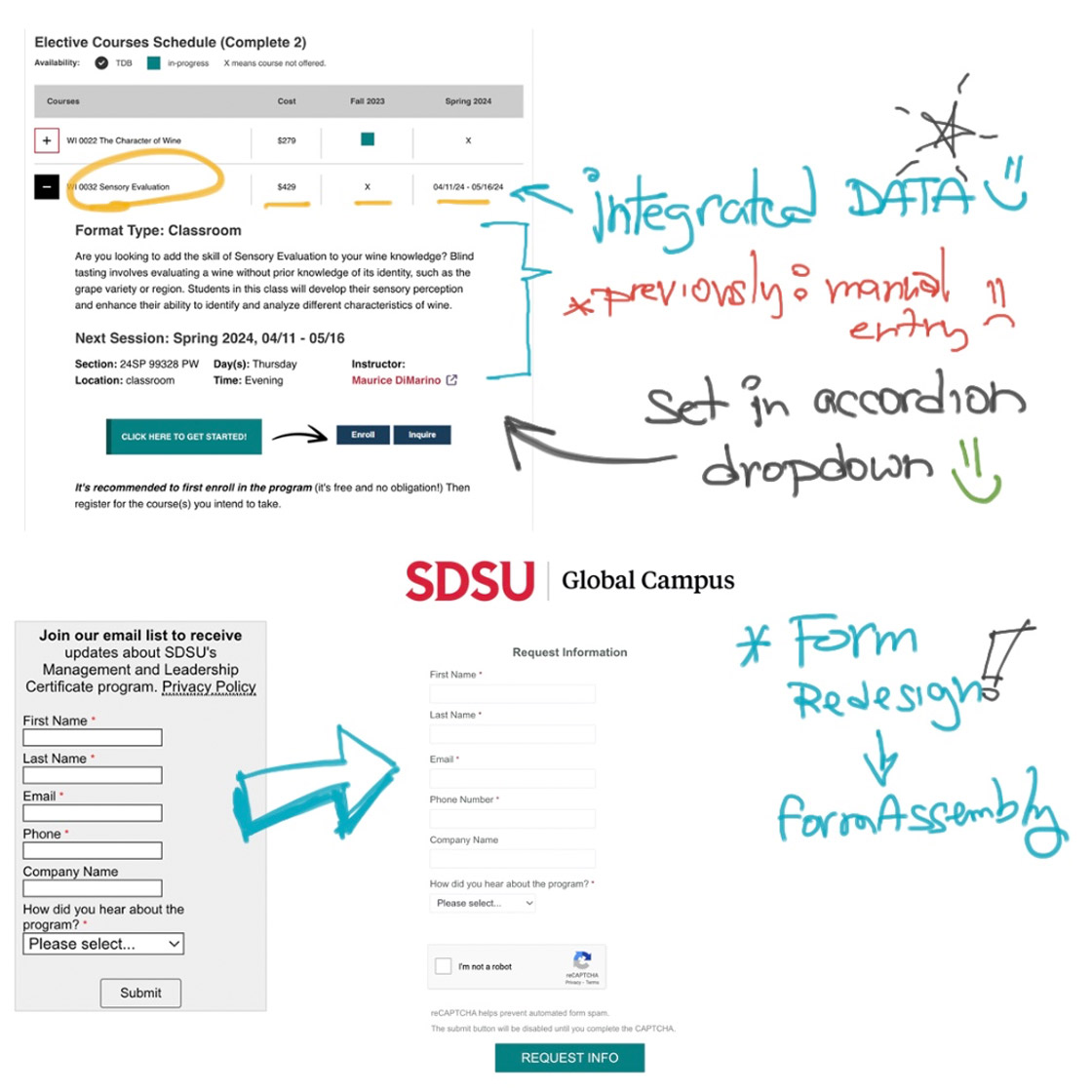
- Course tables aren't connected to integrated data
- Lead gen form needs redesign
- Consider web accessibility issues
Collaborative efforts with both the copy and SEO teams, along with feedback from other departments (including students) guided the webpage redesign.
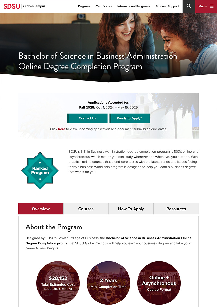
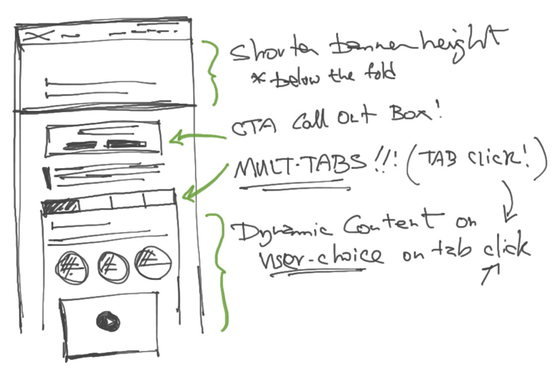
- UX consideration inspired a multi-tab format. The intention is to provide information while the user remains on the same page.
- Overall web design came from the main SDSU.edu website and applied to this WordPress version.
- Wider page layout provides more breathing room in the composition.
- The original content in the sidebar now placed into the fourth tab.
- FormAssembly form redesigned and now used as pop up modals (sticky icons).
- Typography, header tag reorg, and contrast was the focus for web accessibility.
Artboards were provided showing hi-fi mockups, including mobile, of different use cases with various WordPress components and patterns.
As of Oct. 2024, click below to see the updated wider page layout with multi-tabs.
Stakeholders, program managers, their sponsors, and educational personnel from main SDSU campus, have said that the multi-tab solution organizes the "wall of content" in a great way!
- The multi-tabs kept content on ONE web page
- Significant layout redesign has a more favorable, wider viewing space
- Both students and prospects are presented with more easily, digestible, content
- Redesigned course data has a more refined user experience
Upon the Oct. 2024 launch, we integrated accordion dropdowns showing course details and information. View the Courses tab to see the course dropdowns and data in action!

For targeted ad spend, we are tasked to create landing pages for specific educational programs with unique selling props. The goal is to generate qualified leads with visual appeal:
- Apply visual design to drive engagement: click through rates, inquiries/leads
- Use branding logo and marketing copy for efficient calls to action
- Determine whether to use pop up forms or placing the form above the fold
The app used is Unbounce, where a large number pages for various educational programs are created. There we created templates that are scalable for our programs and events.
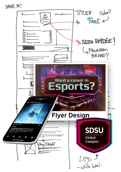
eSports was a project where I took initiative to take the design beyond the template. R&D included: studying gaming companies, FORTNITE, comic book industry, and Comic-Con. I was able to recognize common patterns in typography, color schemes, and overall look and feel.
With feedback from the digital media manager and executive marketing director (at the time), I was able to push my design limits to go beyond and inspire other marketing touch points: flyers, socials, and events.
We chose to go in phases for the new web redesign project. Phase 1 launching is a 1-1 migration from the Drupal 7 to the WordPress conversion. Later phases to include focus groups for feedback, building out the student support web presence, and adapting to new information and direction.